If you run a fashion brand, your website isn't just a catalog. It's where people decide whether they trust you enough to buy. I focus on improving how your store feels, works, and converts — especially on mobile.
A smoother, cleaner store experience makes your visitors feel confident.
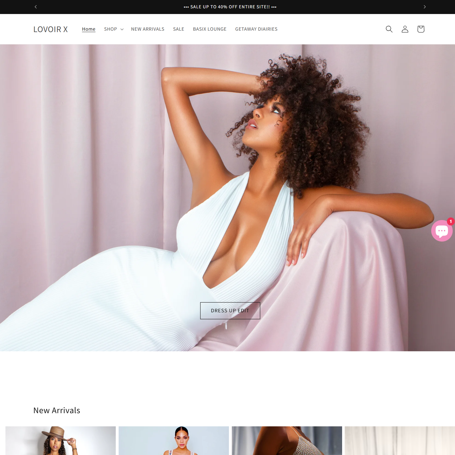
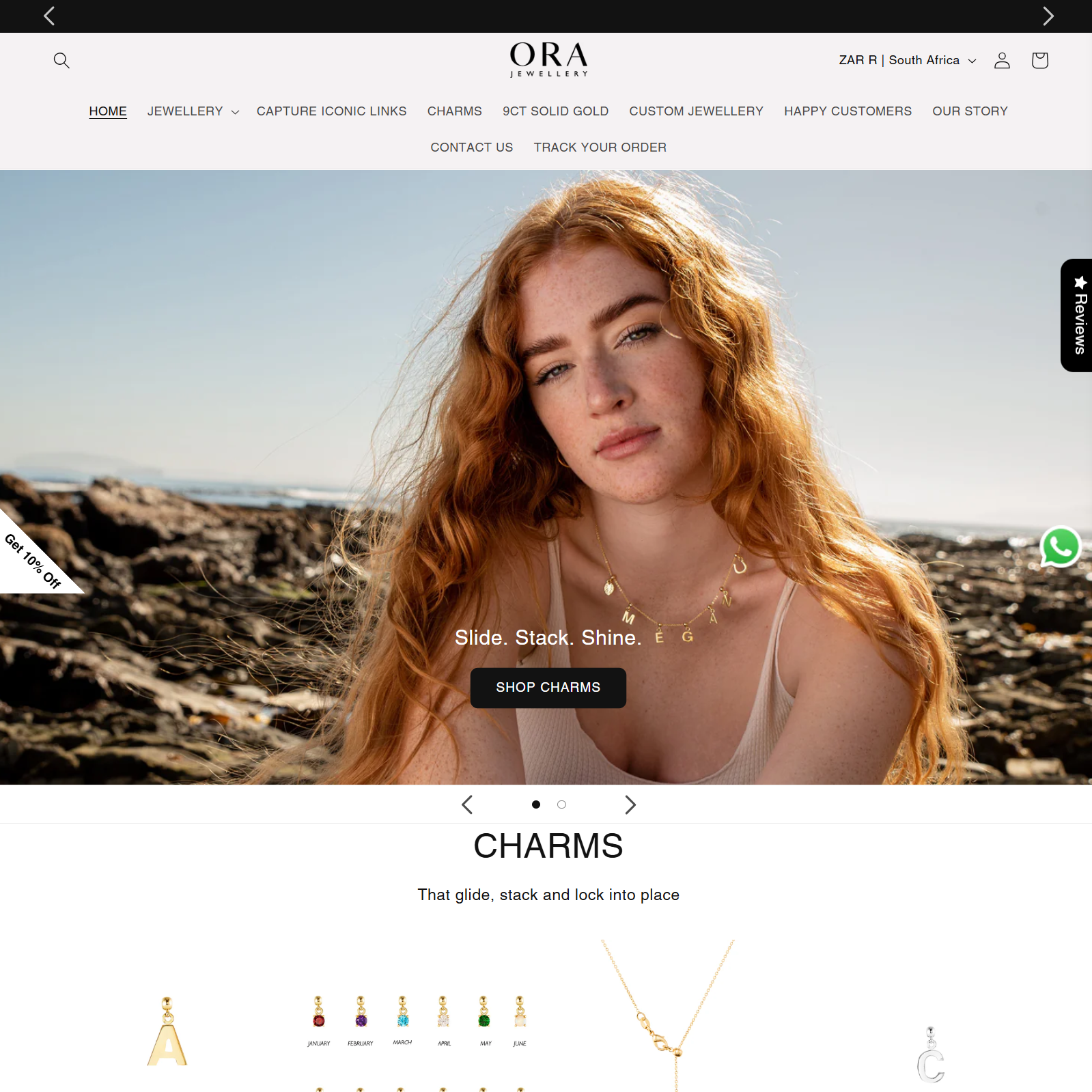
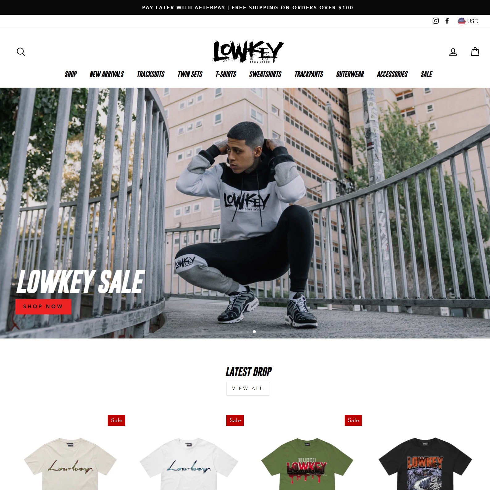
This could be your customer's experience
Many fashion brands struggle with high cart abandonment rates not because of their products, but because of confusing navigation and checkout processes that don't feel premium.
These quotes reflect a variety of fashion brands and store types.
"Working with Huzam felt easy. He understood what we wanted without overcomplicating things."
"He fixed things we didn't even realize were hurting our checkout experience."
"The store feels cleaner and faster now. Customers noticed."
Real collaboration leads to real results
Your website is often the first physical touchpoint customers have with your brand. If it doesn't match the quality they expect from your products, they'll question everything else.
Brands of all sizes — from startups to established shops.


In fashion e-commerce, mobile traffic often exceeds 70%, yet many stores still feel like they were designed for desktop first. This disconnect directly impacts conversion rates.
Here are some projects where I improved usability, visual consistency, and mobile experience.
What I worked on: Product page structure, navigation clarity, and performance tuning.
Why it mattered: When products are unfamiliar or premium-priced, users need clarity before they trust the purchase.
Result: A cleaner product experience that guides users without overwhelming them.
Website: www.lovoirx.com
What I worked on: Layout refinement, mobile spacing, and interaction flow between collections.
Why it mattered: Jewelry buying is emotional, but poor layout breaks that feeling instantly on mobile.
Result: A more fluid browsing experience that keeps attention on the product, not the interface.
Website: www.orajewellery.com
What I worked on: Homepage hierarchy, call-to-action placement, and load behavior.
Why it mattered: Returning users want speed and familiarity, not friction or visual noise.
Result: A homepage that loads cleaner and guides shoppers faster to what they want.
Website: www.lowkeydownunder.com.au
The difference between a good fashion e-commerce site and a great one isn't just about design—it's about understanding how customers actually shop and removing every barrier between inspiration and purchase.
You can reach out via Calendly, email, or LinkedIn — no pressure, just a conversation.